Kivy tutorial 006: Let’s draw something

This is number 6 in a series of introductory Kivy tutorials.

Central themes: Handling touch or mouse input, more canvas instructions

In this tutorial we’ll directly add touch handling to the basic code developed in tutorial 5, starting with the code from last time:

from kivy.app import App
from kivy.uix.boxlayout import BoxLayout
from kivy.uix.slider import Slider

from kivy.uix.widget import Widget
from kivy.graphics import Rectangle, Color

class DrawingWidget(Widget):
    def __init__(self):
        super(DrawingWidget, self).__init__()

        with self.canvas:
            Color(1, 1, 1, 1)
            self.rect = Rectangle(size=self.size,
                                  pos=self.pos)
            Color(1, 0, 0, 1)  # note that we must reset the colour
            Rectangle(size=(300, 100),
                      pos=(300, 200))
        self.bind(pos=self.update_rectangle,
                  size=self.update_rectangle)

    def update_rectangle(self, instance, value):
        self.rect.pos = self.pos
        self.rect.size = self.size


class DrawingApp(App):

    def build(self):
        root_widget = DrawingWidget()
        return root_widget

DrawingApp().run()

We’ve already seen some input interaction via the Button widget, where we could bind to its on_press event to have a function called whenever the Button was clicked. This is great for a Button, but is not a general way to handle interaction - it gives no indication of the position of the touch, or any other information like the button clicked on the mouse.

Kivy achieves general mouse/touch handling via the on_touch_down, on_touch_move and on_touch_up methods of all Widget classes. Let’s dive in with an example, modifying our DrawingWidget:

from random import random

class DrawingWidget(Widget):
    def __init__(self):
        super(DrawingWidget, self).__init__()

        with self.canvas:
            Color(1, 1, 1, 1)
            self.rect = Rectangle(size=self.size,
                                  pos=self.pos)
            self.rect_colour = Color(1, 0, 0, 1)  # note that we must reset the colour
            Rectangle(size=(300, 100),
                      pos=(300, 200))
        self.bind(pos=self.update_rectangle,
                  size=self.update_rectangle)


    def update_rectangle(self, instance, value):
        self.rect.pos = self.pos
        self.rect.size = self.size

    def on_touch_down(self, touch):
        self.rect_colour.rgb = (random(), random(), random())
        print('touch pos is {}'.format(touch.pos))

Note that the only changes are to set self.rect_colour, and to add the on_touch_down method. Run the code now, and whenever you click the screen you should see the colour of the rectangle change.

How does this work? The answer is that whenever a mouse click or touch is registered, the root widget’s on_touch_down method is called, with a touch object holding information about the touch: you can see this here, where we access the pos of this object to get the pixel coordinates of its position. Each widget passes this touch object to all its children. For this reason, it’s important to call super(...) if you want the touch to also be passed to the current Widget’s children, though as it happens that’s not actually important here.

Note that although these methods are called on_touch_..., and I’ve called the argument touch, they are used for both mouse and touch handling; these events are handled in exactly the same way, except that the touch object may contain different information such as the button clicked (in the case of the mouse). I’ll mostly refer to this input as ‘touch’, but this always includes mouse interaction too.

The other methods I mentioned, on_touch_move and on_touch_up, work the same way; they are called whenever that thing happens, though only when on_touch_down has already happened, you don’t get events when moving the mouse without having clicked. We can use this to achieve drawing.

First, change the kivy.graphics import to include Line:

from kivy.graphics import Rectangle, Color, Line

Then, add modify on_touch_down and on_touch_move to draw and update a Line each time:

def on_touch_down(self, touch):
    super(DrawingWidget, self).on_touch_down(touch)

    with self.canvas:
        Color(random(), random(), random())
        self.line = Line(points=[touch.pos[0], touch.pos[1]], width=2)

def on_touch_move(self, touch):
    self.line.points = self.line.points + [touch.pos[0], touch.pos[1]]

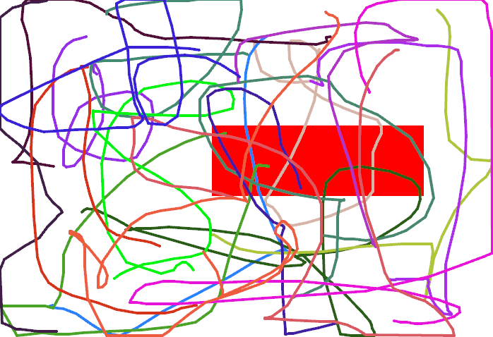
Run the code again, and try clicking and dragging…you should see a line! Each time you click and drag the line has a different colour, as we add a new random Color instruction before its instruction each time. We’re updating it by adding the x and y value of the touch position to the Line’s points, every time the touch is moved.
Lines drawn in example app

You can also note that we only use with self.canvas when the Line is instantiated - not when it is updated. This is because we only need to add the Line canvas instruction to the canvas once, after that the gui will automatically be updated whenever the Line changes, including if we modified e.g. its width. Try changing self.line.width in on_touch_move and see what happens.

Note: This way of storing the line (in self.line) isn’t very robust if there are multiple simultaneous interactions, e.g. in a multitouch display. This is easy to resolve by storing the reference somewhere more appropriate, e.g. we could set touch.ud['line'] to store a reference specific to the touch object (ud stands for “user dictionary”, see the documentation). You might like to try implementing this.

You could continue here by experimenting with other actions in response to touches, such as drawing different things (e.g. a Rectangle at the touch position rather than a Line) or doing more complex modifications to existing instructions.

With the basic drawing apparatus set up, the next tutorial will introduce the kv markup language, showing how a gui can easily be constructed without some of the Python boilerplate that comes from using a general purpose language for creating a gui.

Next tutorial: Introducing kv language

Full code

main.py:

from kivy.app import App
from kivy.uix.boxlayout import BoxLayout
from kivy.uix.slider import Slider

from kivy.uix.widget import Widget
from kivy.graphics import Rectangle, Color, Line

from random import random

class DrawingWidget(Widget):
    def __init__(self):
        super(DrawingWidget, self).__init__()

        with self.canvas:
            Color(1, 1, 1, 1)
            self.rect = Rectangle(size=self.size,
                                  pos=self.pos)
            self.rect_colour = Color(1, 0, 0, 1)  # note that we must reset the colour
            Rectangle(size=(300, 100),
                      pos=(300, 200))
        self.bind(pos=self.update_rectangle,
                  size=self.update_rectangle)


    def update_rectangle(self, instance, value):
        self.rect.pos = self.pos
        self.rect.size = self.size

    def on_touch_down(self, touch):
        super(DrawingWidget, self).on_touch_down(touch)

        with self.canvas:
            Color(random(), random(), random())
            self.line = Line(points=[touch.pos[0], touch.pos[1]], width=2)

    def on_touch_move(self, touch):
        self.line.points = self.line.points + [touch.pos[0], touch.pos[1]]


class DrawingApp(App):

    def build(self):
        root_widget = DrawingWidget()
        return root_widget

DrawingApp().run()
Kivy tutorial 006: Let’s draw something

Central themes: Handling touch or mouse input, more canvas instructions

In this tutorial we’ll directly add touch handling to the basic code developed in tutorial 5, starting with the code from last time:

from kivy.app import App
from kivy.uix.boxlayout import BoxLayout
from kivy.uix.slider import Slider

from kivy.uix.widget import Widget
from kivy.graphics import Rectangle, Color

class DrawingWidget(Widget):
    def __init__(self):
        super(DrawingWidget, self).__init__()

        with self.canvas:
            Color(1, 1, 1, 1)
            self.rect = Rectangle(size=self.size,
                                  pos=self.pos)
            Color(1, 0, 0, 1)  # note that we must reset the colour
            Rectangle(size=(300, 100),
                      pos=(300, 200))
        self.bind(pos=self.update_rectangle,
                  size=self.update_rectangle)

    def update_rectangle(self, instance, value):
        self.rect.pos = self.pos
        self.rect.size = self.size


class DrawingApp(App):

    def build(self):
        root_widget = DrawingWidget()
        return root_widget

DrawingApp().run()

We’ve already seen some input interaction via the Button widget, where we could bind to its on_press event to have a function called whenever the Button was clicked. This is great for a Button, but is not a general way to handle interaction - it gives no indication of the position of the touch, or any other information like the button clicked on the mouse.

Kivy achieves general mouse/touch handling via the on_touch_down, on_touch_move and on_touch_up methods of all Widget classes. Let’s dive in with an example, modifying our DrawingWidget:

from random import random

class DrawingWidget(Widget):
    def __init__(self):
        super(DrawingWidget, self).__init__()

        with self.canvas:
            Color(1, 1, 1, 1)
            self.rect = Rectangle(size=self.size,
                                  pos=self.pos)
            self.rect_colour = Color(1, 0, 0, 1)  # note that we must reset the colour
            Rectangle(size=(300, 100),
                      pos=(300, 200))
        self.bind(pos=self.update_rectangle,
                  size=self.update_rectangle)


    def update_rectangle(self, instance, value):
        self.rect.pos = self.pos
        self.rect.size = self.size

    def on_touch_down(self, touch):
        self.rect_colour.rgb = (random(), random(), random())
        print('touch pos is {}'.format(touch.pos))

Note that the only changes are to set self.rect_colour, and to add the on_touch_down method. Run the code now, and whenever you click the screen you should see the colour of the rectangle change.

How does this work? The answer is that whenever a mouse click or touch is registered, the root widget’s on_touch_down method is called, with a touch object holding information about the touch: you can see this here, where we access the pos of this object to get the pixel coordinates of its position. Each widget passes this touch object to all its children. For this reason, it’s important to call super(...) if you want the touch to also be passed to the current Widget’s children, though as it happens that’s not actually important here.

Note that although these methods are called on_touch_..., and I’ve called the argument touch, they relate to both mouse and touch handling; these events are handled in exactly the same way, except that the touch object may contain different information such as the button clicked (in the case of the mouse). I’ll switch to mostly referring to this input as ‘touch’, but this always includes mouse interaction too.

The other methods I mentioned, on_touch_move and on_touch_up, work the same way; they are called whenever that thing happens, though only when on_touch_down has already happened, you don’t get events when moving the mouse without having clicked. We can use this to achieve drawing.

First, change the kivy.graphics import to include Line:

from kivy.graphics import Rectangle, Color, Line

Then, add modify on_touch_down and on_touch_move to draw and update a Line each time:

def on_touch_down(self, touch):
    super(DrawingWidget, self).on_touch_down(touch)

    with self.canvas:
        Color(random(), random(), random())
        self.line = Line(points=[touch.pos[0], touch.pos[1]], width=2)

def on_touch_move(self, touch):
    self.line.points = self.line.points + [touch.pos[0], touch.pos[1]]

Run the code again, and try clicking and dragging…you should see a line! Each time you click and drag the line has a different colour, as we add a new random Color instruction before its instruction each time. We’re updating it by adding the x and y value of the touch position to the Line’s points, every time the touch is moved.

Lines drawn in example app

You can also note that we only use with self.canvas when the Line is instantiated - not when it is updated. This is because we only need to add the Line canvas instruction to the canvas once, after that the gui will automatically be updated whenever the Line changes, including if we modified e.g. its width. Try changing self.line.width in on_touch_move and see what happens.

Note

This way of storing the line (in self.line) isn’t very robust if there are multiple simultaneous interactions, e.g. in a multitouch display. This is easy to resolve by storing the reference more cleverly, including in the touch object itself, but I’ve just ignored the issue here.

You could continue here by experimenting with other actions in response to touches, such as drawing different things (e.g. a Rectangle at the touch position rather than a Line) or doing more complex modifications to existing instructions.

With the basic drawing apparatus set up, the next tutorial will introduce the kv markup language, showing how a gui can easily be constructed without some of the Python boilerplate that comes from using a general purpose language for creating a gui.

Full code

main.py:

from kivy.app import App
from kivy.uix.boxlayout import BoxLayout
from kivy.uix.slider import Slider

from kivy.uix.widget import Widget
from kivy.graphics import Rectangle, Color, Line

from random import random

class DrawingWidget(Widget):
    def __init__(self):
        super(DrawingWidget, self).__init__()

        with self.canvas:
            Color(1, 1, 1, 1)
            self.rect = Rectangle(size=self.size,
                                  pos=self.pos)
            self.rect_colour = Color(1, 0, 0, 1)  # note that we must reset the colour
            Rectangle(size=(300, 100),
                      pos=(300, 200))
        self.bind(pos=self.update_rectangle,
                  size=self.update_rectangle)


    def update_rectangle(self, instance, value):
        self.rect.pos = self.pos
        self.rect.size = self.size

    def on_touch_down(self, touch):
        super(DrawingWidget, self).on_touch_down(touch)

        with self.canvas:
            Color(random(), random(), random())
            self.line = Line(points=[touch.pos[0], touch.pos[1]], width=2)

    def on_touch_move(self, touch):
        self.line.points = self.line.points + [touch.pos[0], touch.pos[1]]


class DrawingApp(App):

    def build(self):
        root_widget = DrawingWidget()
        return root_widget

DrawingApp().run()
Kivy tutorial 005: A drawing app

This is number 5 in a series of introductory Kivy tutorials.

Central themes: Canvas instructions

The next couple of tutorials will move to a new application in order to showcase some more of Kivy’s core components. In this tutorial we’ll cover canvas instructions, Kivy’s low level drawing API which is always available. In the next two, we’ll add touch/mouse interaction to let you click to draw stuff, and then introduce kv language, and show how it interacts with Python code to easily produce guis without so much Python boilerplate.

To showcase Kivy’s drawing API, our next app will be a simple drawing application. We’ll be making a widget gui to select a few different options (colour, size etc.), and handling the mouse/touch interaction manually to draw the result of user input.

We’ll need to start with a new basic app template, as introduced in the first couple of tutorials:

from kivy.app import App


class DrawingApp(App):
    def build(self):
        return None

DrawingApp().run()

Before anything else, let’s start by getting some basic drawing working, with no other gui components. There isn’t a Widget for drawing already (there’s no nice way to abstract all the options you might want), so instead Kivy makes it easy to build your own Widget class:

from kivy.uix.widget import Width

class DrawingWidget(Widget):
    pass

class DrawingApp(App):
    def build(self):
        return DrawingWidget()

DrawingApp().run()

You can run the app now, but the screen will just be black because Widget (and therefore DrawingWidget) doesn’t draw anything by default. We’re using Widget as the base class because we want to add it to the screen, but don’t need any extra behaviour beyond that.

Time to do our own drawing. Change your code to add the following:

from kivy.app import App
from kivy.uix.boxlayout import BoxLayout
from kivy.uix.slider import Slider

from kivy.uix.widget import Widget
from kivy.graphics import Rectangle, Color

class DrawingWidget(Widget):
    def __init__(self):
        super(DrawingWidget, self).__init__()

        with self.canvas:
            Color(1, 0, 0, 1)  # arguments are red, green, blue, alpha
            Rectangle(size=(300, 100),
                      pos=(300, 200))


class DrawingApp(App):

    def build(self):
        root_widget = DrawingWidget()
        return root_widget

DrawingApp().run()
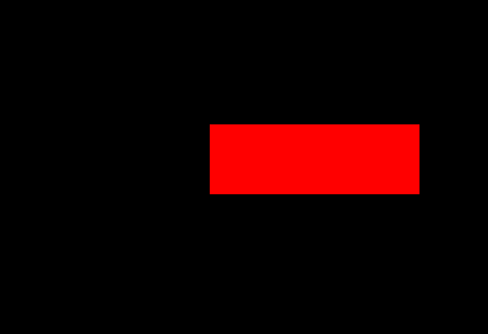
If you run the app now, you’ll see a red rectangle. Its position in pixels will be 300 right and 200 up from the bottom left of the screen; Kivy’s coordinate system follows OpenGL using the bottom left as the (0, 0) point.

Rectangle in example app

This is the basic way of doing any kind of drawing, and with a combination of canvas instructions (also called graphics instructions) you can achieve any kind of gui result. In fact, anything you see drawn with Kivy is ultimately using canvas instructions, including all the built in widget classes!

To describe what actually happened here: we first opened a with self.canvas block. The canvas context manager sets an internal variable that means all graphics instructions will automatically be added to the canvas we just opened, in this case the canvas of the current DrawingWidget. All widgets have a canvas that works the same way, you can draw on e.g. a Label or BoxLayout if you want. Next we instantiated our graphics instructions; in this case we use Color (which sets the colour of any following instructions) and Rectangle (which draws a rectangle at the given position). Any instructions you add later will be drawn on top of the previous ones.

Try changing these arguments to modify what you see. The arguments to Color are red, green, blue and alpha components (currently opaque red). You can also try drawing other shapes by checking the vertex instruction documentation (vertex instructions are shapes, other instructions like Color are claled context instructions and include e.g. translation and rotation).

Note: As with several other things mentioned so far, canvas instructions have their own simple syntax for drawing in kv language, introduced in 007: Introducing Kivy language.

Note: You can also access self.canvas.before and self.canvas.after; everything in the former is drawn first, then everything in self.canvas, then everything in self.canvas.after. These are designed to cover most basic requirements for layer-based drawing, but you can also introduce further layers if you want to.

Let’s now draw a Rectangle that fills the whole DrawingWidget, to serve as the background for anything else we draw:

from kivy.app import App
from kivy.uix.boxlayout import BoxLayout
from kivy.uix.slider import Slider

from kivy.uix.widget import Widget
from kivy.graphics import Rectangle, Color

class DrawingWidget(Widget):
    def __init__(self):
        super(DrawingWidget, self).__init__()

        with self.canvas:
            Color(1, 1, 1, 1)
            Rectangle(size=self.size,
                      pos=self.pos)


class DrawingApp(App):

    def build(self):
        root_widget = DrawingWidget()
        return root_widget

DrawingApp().run()
Surprise, it doesn’t work right! Although we set the rectangle size to self.size (the size of the DrawingWidget), and its pos to self.pos (the pos of the DrawingWidget), it always appears in the bottom left of the window and has size 100 pixels square. This is because although the DrawingWidget automatically fills the window (because it is the root widget), its pos and size are not set until after its __init__ method has finished.

Note: pos and size are two more Kivy properties that all widgets have. They give the position of the bottom left corner (in pixels) and the size of the Widget (also in pixels).

To solve this problem, we again use event bindings:

class DrawingWidget(Widget):
    def __init__(self):
        super(DrawingWidget, self).__init__()

        with self.canvas:
            Color(1, 1, 1, 1)
            self.rect = Rectangle(size=self.size,
                                  pos=self.pos)
        self.bind(pos=self.update_rectangle,
                  size=self.update_rectangle)


    def update_rectangle(self, instance, value):
        self.rect.pos = self.pos
        self.rect.size = self.size

This works just like in the previous tutorials; we’ve bound to the pos and size of the widget, and made it so that whenever they update the Rectangle is also updated. Remember, this is possible because pos and size are Kivy properties, which you can also bind to (the function is called when their value changes). When run, your app should now look like the following:

Rectangle in example app

This tutorial has introduced the basic use of canvas instructions, including the notion of automatically updating them in response to gui changes, thanks to event binding. This is an important building block for building complex applications.

In the next tutorial we’ll introduce mouse/touch input handling, so that we can finally draw something dynamicall in response to user input.

Next tutorial: Let’s draw something

Full code

main.py:

from kivy.app import App
from kivy.uix.boxlayout import BoxLayout
from kivy.uix.slider import Slider

from kivy.uix.widget import Widget
from kivy.graphics import Rectangle, Color

class DrawingWidget(Widget):
    def __init__(self):
        super(DrawingWidget, self).__init__()

        with self.canvas:
            Color(1, 1, 1, 1)
            self.rect = Rectangle(size=self.size,
                                  pos=self.pos)
        self.bind(pos=self.update_rectangle,
                  size=self.update_rectangle)


    def update_rectangle(self, instance, value):
        self.rect.pos = self.pos
        self.rect.size = self.size


class DrawingApp(App):

    def build(self):
        root_widget = DrawingWidget()
        return root_widget

DrawingApp().run()
Kivy tutorial 005: A drawing app

Central themes: Canvas instructions

The next couple of tutorials will move to a new application in order to showcase some more of Kivy’s core components. In this tutorial we’ll cover canvas instructions, Kivy’s low level drawing API which is always available. In the next two, we’ll add touch/mouse interaction to let you click to draw stuff, and then introduce kv language, and show how it interacts with Python code to easily produce guis without so much Python boilerplate.

To showcase Kivy’s drawing API, our next app will be a simple drawing application. We’ll be making a widget gui to select a few different options (colour, size etc.), and handling the mouse/touch interaction manually to draw the result of user input.

We’ll need to start with a new basic app template, as introduced in the first couple of tutorials:

from kivy.app import App


class DrawingApp(App):
    def build(self):
        return None

DrawingApp().run()

Before anything else, let’s start by getting some basic drawing working, with no other gui components. There isn’t a Widget for drawing already (there’s no nice way to abstract all the options you might want), so instead Kivy makes it easy to build your own Widget class:

from kivy.uix.widget import Width

class DrawingWidget(Widget):
    pass

class DrawingApp(App):
    def build(self):
        return DrawingWidget()

DrawingApp().run()

You can run the app now, but the screen will just be black because Widget (and therefore DrawingWidget) doesn’t draw anything by default. We’re using Widget as the base class because we want to add it to the screen, but don’t need any extra behaviour beyond that.

Time to do our own drawing. Change your code to add the following:

from kivy.app import App
from kivy.uix.boxlayout import BoxLayout
from kivy.uix.slider import Slider

from kivy.uix.widget import Widget
from kivy.graphics import Rectangle, Color

class DrawingWidget(Widget):
    def __init__(self):
        super(DrawingWidget, self).__init__()

        with self.canvas:
            Color(1, 0, 0, 1)  # the arguments are red, blue,
                               # green, alpha
            Rectangle(size=(300, 100),
                      pos=(300, 200))


class DrawingApp(App):

    def build(self):
        root_widget = DrawingWidget()
        return root_widget

DrawingApp().run()

If you run the app now, you’ll see a red rectangle. Its position in pixels will be 300 right and 200 up from the bottom left of the screen; Kivy’s coordinate system follows OpenGL in having its coordinate origin there.

Rectangle in example app

This is the basic way of doing any kind of drawing, and with a combination of canvas instructions (also called graphics instructions) you can achieve any kind of gui result. In fact, anything you see drawn with Kivy is ultimately using canvas instructions, including all the built in widget classes!

The basic procedure always follows this one. First, open a with self.canvas block - this sets an internal variable that means all graphics instructions are drawn to the canvas of the current widget. All widgets have a canvas, you can draw on e.g. a Label or BoxLayout if you want. Second, instantiate any graphics instructions; in this case we use Color (which sets the colour of any following instructions) and Rectangle (which draws a rectangle at the given position). Any instructions you add later will be drawn on top of the previous ones.

Try changing these arguments to modify what you see. The arguments to Color are red, green, blue and alpha components (currently opaque red). You can also try drawing other shapes by checking the vertex instruction documentation (vertex instructions are shapes, other instructions like Color are claled context instructions and include e.g. translation and rotation).

Note

As with several other things mentioned so far, canvas instructions have their own simple syntax for drawing in kv language, introduced in tutorial 7.

Note

You can also access self.canvas.before and self.canvas.after; everything in the former is drawn first, then everything in self.canvas, then everything in self.canvas.after. This helps you to draw in layers if necessary.

Let’s now draw a Rectangle filling the whole DrawingWidget, serving as the background of anything we draw:

from kivy.app import App
from kivy.uix.boxlayout import BoxLayout
from kivy.uix.slider import Slider

from kivy.uix.widget import Widget
from kivy.graphics import Rectangle, Color

class DrawingWidget(Widget):
    def __init__(self):
        super(DrawingWidget, self).__init__()

        with self.canvas:
            Color(1, 1, 1, 1)
            Rectangle(size=self.size,
                      pos=self.pos)


class DrawingApp(App):

    def build(self):
        root_widget = DrawingWidget()
        return root_widget

DrawingApp().run()
Surprise, it doesn’t work right! Although we set the rectangle size to self.size (the size of the DrawingWidget), and its pos to self.pos (the pos of the DrawingWidget), it always appears in the bottom left of the window and has size 100 pixels square. This is because although the DrawingWidget fills the window (because it is the root widget), its pos and size are not set until after its __init__ method has finished.

Note

pos and size are two more Kivy properties that all widgets have. They give the position of the bottom left corner (in pixels) and the size of the Widget (also in pixels).

To solve this problem, we again use event bindings:

class DrawingWidget(Widget):
    def __init__(self):
        super(DrawingWidget, self).__init__()

        with self.canvas:
            Color(1, 1, 1, 1)
            self.rect = Rectangle(size=self.size,
                                  pos=self.pos)
        self.bind(pos=self.update_rectangle,
                  size=self.update_rectangle)


    def update_rectangle(self, instance, value):
        self.rect.pos = self.pos
        self.rect.size = self.size

This works just like in the previous tutorials; we’ve bound to the pos and size of the widget, and made it so that whenever they update the Rectangle is also updated. Remember, this is possible because pos and size are Kivy properties, which you can also bind to (the function is called when their value changes). When run, your app should now look like the following:

Rectangle in example app

This tutorial has introduced the basic use of canvas instructions, including the notion of automatically updating them in response to gui changes, thanks to event binding. This is an important building block for building complex applications.

In the next tutorial we’ll introduce mouse/touch input handling, so that we can finally draw something dynamicall in response to user input.

Full code

main.py:

from kivy.app import App
from kivy.uix.boxlayout import BoxLayout
from kivy.uix.slider import Slider

from kivy.uix.widget import Widget
from kivy.graphics import Rectangle, Color

class DrawingWidget(Widget):
    def __init__(self):
        super(DrawingWidget, self).__init__()

        with self.canvas:
            Color(1, 1, 1, 1)
            self.rect = Rectangle(size=self.size,
                                  pos=self.pos)
        self.bind(pos=self.update_rectangle,
                  size=self.update_rectangle)


    def update_rectangle(self, instance, value):
        self.rect.pos = self.pos
        self.rect.size = self.size


class DrawingApp(App):

    def build(self):
        root_widget = DrawingWidget()
        return root_widget

DrawingApp().run()

Kivy tutorial 004: Making the GUI do stuff, binding to events

Central themes: Events and Kivy properties

We left the last tutorial with a calculator app GUI with some nice automatic behaviour, but which doesn’t actually do anything. Let’s change that; it’s time to learn about binding events.

To refresh, the basic calculator GUI code was as follows. If you modified it to experiment, feel free to continue with your modified code, and try to change the instructions to fit your modifications:

from kivy.app import App
from kivy.uix.button import Button
from kivy.uix.boxlayout import BoxLayout
from kivy.uix.gridlayout import GridLayout
from kivy.uix.label import Label


class YourApp(App):
    def build(self):
        root_widget = BoxLayout(orientation='vertical')

        output_label = Label(size_hint_y=1)

        button_symbols = ('1', '2', '3', '+',
                          '4', '5', '6', '-',
                          '7', '8', '9', '.',
                          '0', '*', '/', '=')

        button_grid = GridLayout(cols=4, size_hint_y=2)
        for symbol in button_symbols:
            button_grid.add_widget(Button(text=symbol))

        clear_button = Button(text='clear', size_hint_y=None,
                              height=100)

        root_widget.add_widget(output_label)
        root_widget.add_widget(button_grid)
        root_widget.add_widget(clear_button)

        return root_widget


YourApp().run()

Note

This tutorial introduces some major new Kivy concepts. I recommend working through it even if you don’t entirely follow what’s going on, then going back to modify components and see how things change.

The plan now is that every one of these buttons should add their symbol to the Label at the top, except ‘=’ which should evaluate the code and display the result. This is obviously an extremely basic calculator, but the point here is to showcase some Kivy basics - if you’d like to improve the interface, go ahead with trying to do so along the way.

To make the buttons do something, we must bind to their events. This is a generic Kivy concept; whenever you want one thing to trigger another, you look for an event to bind to. Some widgets such as Button have events indicating they have been clicked on, and every Kivy property (such as all those used to customise Widgets so far) has an associated event when it changes.

Let’s start with a simple binding example:

def print_button_text(self, instance):
    print(instance.text)
for button in button_grid.children[1:]:  # note use of the
                                         # `children` property
    button.bind(on_press=print_button_text)

# we could also have used `button.bind(on_press=lambda instance: print(instance.text))`

If you run the code now, and click on any of the buttons, you should see its text printed in the console (but not in the Kivy GUI).

The key concept here is the bind method, which you can use with any Widget, as well as several other Kivy objects (discussed in later tutorials). This takes any number of keyword arguments, each specifying an event name and a function to call; in this case the event name is on_press, and the function to be called is our new print_button_text`. The ``bind` method makes sure that whenever on_press occurs, the function is called. It automatically receives a single argument, the binded widget instance.

Also note that we’ve iterated over button_grid.children[1:]`. The ``children` property is available on any Widget, and holds a list of all the widgets added to it, in reverse order. In this case, we use [1:] to skip the first element, ‘=’, as we want to use this to evaluate the result.

Note

Button also has an on_release event that is called when the user releases a click or touch. You can find more information in the Button documentation.

This binding idea is very normal in Kivy, and you’ll quickly get used to seeing it used in different ways, including some introduced later in these tutorials. The kv markup language, also introduced later, has special syntax designed to make it even simpler and clearer.

Anyway, all this does so far is print some text when the event occurs, but we want to update the GUI. Let’s change the bound function to achieve that:

def print_button_text(instance):
    output_label.text += instance.text

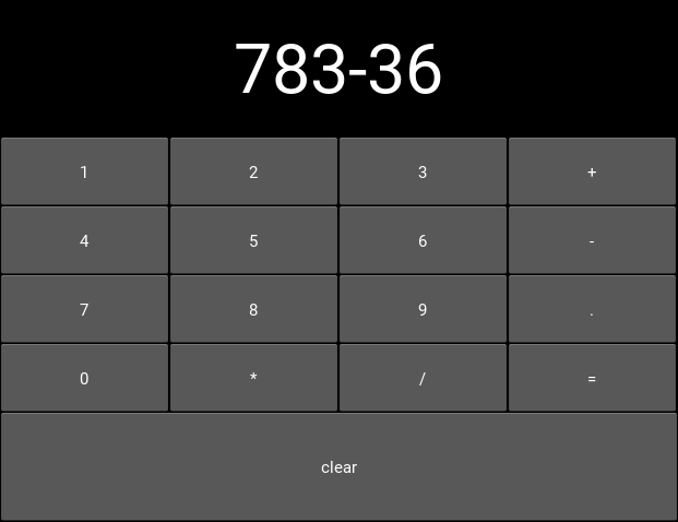
Run the code again. Now when you press the buttons, you should see the text appear at the top of the screen, as in the screenshot below:

Calculator text after number input

At this point, a new problem presents itself; the font size of the label is kind of small. We can use another event to have it update automatically in response to the label’s height:

def resize_label_text(label, new_height):
    label.font_size = 0.5*label.height
output_label.bind(height=resize_label_text)

Note that the event here is named height. This works because the Label has a Kivy property named height (as do all Widgets, see the documentation, and all Kivy properties can be bound to as an event of the same name, called when the property changes. In this case, you can now resize the window, which causes the layouts in the Widget tree to automatically resize their children, which in turn causes resize_label_text to automatically be called.

We’ll use one final binding to make the calculator interface actually work; when the ‘=’ button is pressed, we can evaluate the entire label text as python code, and display the result.

Note

Using eval as a calculator like this is in general a terrible idea, used here only to avoid dwelling on the details rather than the Kivy principles.

def evaluate_result(instance):
    try:
        output_label.text = str(eval(output_label.text))
    except SyntaxError:
        output_label.text = 'Python syntax error!'
button_grid.children[0].bind(on_press=evaluate_result)
# Remember, button_grid.children[0] is the '=' button

Further, we can make the ‘clear’ button clear the label, so that you can start a new calculation:

def clear_label(instance):
    output_label.text = ''
clear_button.bind(on_press=clear_label)

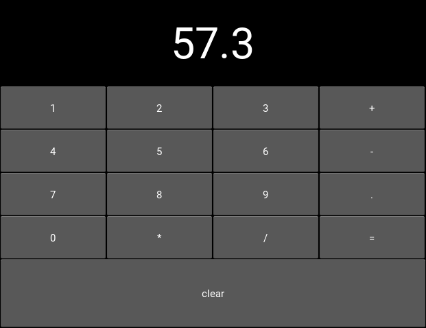
With this all in place, run the app again and…the calculator works! Every button now does something, either adding its symbol to the output label, evaluating the label’s text as python code, or clearing the result. You should be seeing something like the image below:

Output for calculator app with number input

These core event binding concepts are central to working with Kivy widgets, and come up in many different ways. Don’t worry if you don’t remember all the details straight away, such as the way all properties have events you can bind to, or the specific syntax; you can look all this up in the documentation as linked throughout and indexed on the Kivy website. Later tutorials also follow on to help cement this knowledge.

Full code

your_filename.py:

from kivy.app import App
from kivy.uix.button import Button
from kivy.uix.boxlayout import BoxLayout
from kivy.uix.gridlayout import GridLayout
from kivy.uix.label import Label


class YourApp(App):
    def build(self):
        root_widget = BoxLayout(orientation='vertical')

        output_label = Label(size_hint_y=1)

        button_symbols = ('1', '2', '3', '+',
                          '4', '5', '6', '-',
                          '7', '8', '9', '.',
                          '0', '*', '/', '=')

        button_grid = GridLayout(cols=4, size_hint_y=2)
        for symbol in button_symbols:
            button_grid.add_widget(Button(text=symbol))

        clear_button = Button(text='clear', size_hint_y=None,
                              height=100)

        def print_button_text(instance):
            output_label.text += instance.text
        for button in button_grid.children[1:]:  # note use of the
                                             # `children` property
            button.bind(on_press=print_button_text)

        def resize_label_text(label, new_height):
            label.font_size = 0.5*label.height
        output_label.bind(height=resize_label_text)

        def evaluate_result(instance):
            try:
                output_label.text = str(eval(output_label.text))
            except SyntaxError:
                output_label.text = 'Python syntax error!'
        button_grid.children[0].bind(on_press=evaluate_result)

        def clear_label(instance):
            output_label.text = ''
        clear_button.bind(on_press=clear_label)

        root_widget.add_widget(output_label)
        root_widget.add_widget(button_grid)
        root_widget.add_widget(clear_button)

        return root_widget


YourApp().run()

Kivy tutorial 004: Making the GUI do stuff, binding to events

This is number 4 in a series of introductory Kivy tutorials.

Central themes: Events and Kivy properties

We left the last tutorial with a calculator app GUI with some nice automatic behaviour, but which doesn’t actually do anything. Let’s change that; it’s time to learn about binding events.

To refresh, the basic calculator GUI code was as follows. If you modified it to experiment, feel free to continue with your modified code, and try to change the instructions to fit your modifications:

from kivy.app import App
from kivy.uix.button import Button
from kivy.uix.boxlayout import BoxLayout
from kivy.uix.gridlayout import GridLayout
from kivy.uix.label import Label


class YourApp(App):
    def build(self):
        root_widget = BoxLayout(orientation='vertical')

        output_label = Label(size_hint_y=1)

        button_symbols = ('1', '2', '3', '+',
                          '4', '5', '6', '-',
                          '7', '8', '9', '.',
                          '0', '*', '/', '=')

        button_grid = GridLayout(cols=4, size_hint_y=2)
        for symbol in button_symbols:
            button_grid.add_widget(Button(text=symbol))

        clear_button = Button(text='clear', size_hint_y=None,
                              height=100)

        root_widget.add_widget(output_label)
        root_widget.add_widget(button_grid)
        root_widget.add_widget(clear_button)

        return root_widget


YourApp().run()

Note: This tutorial introduces some major new Kivy concepts. I recommend working through it even if you don’t entirely follow what’s going on, then going back to modify components and see how things change.

The plan now is that every one of these buttons should add their symbol to the Label at the top, except = which should evaluate the code and display the result. This is obviously an extremely basic calculator, but the point here is to showcase some Kivy basics - if you’d like to improve the interface, go ahead!

To make the buttons do something, we must bind to their events. This is a generic Kivy concept; whenever you want one thing to trigger another, you look for an event to bind to. Some widgets such as Button have events indicating they have been clicked on, and every Kivy property (such as all those used to customise Widgets so far) has an associated event when it changes.

Let’s start with a simple binding example:

def print_button_text(instance):
    print(instance.text)
for button in button_grid.children[1:]:
    button.bind(on_press=print_button_text)

# we could also have used `button.bind(on_press=lambda instance: print(instance.text))`

If you run the code now, and click on any of the buttons, you should see its text printed in the console (but not in the Kivy GUI).

The key concept here is the bind method, which you can use with any Widget, as well as several other Kivy objects (discussed in later tutorials). This takes any number of keyword arguments, each specifying an event name and a function to call; in this case the event name is on_press, and the function to be called is our new print_button_text. The bind method makes sure that whenever on_press occurs, the function is called. It automatically receives a single argument, the bind-ed widget instance.

Also note that we’ve iterated over button_grid.children[1:]`. The ``children` property is available on any Widget, and holds a list of all the widgets added to it, in reverse order. In this case, we use [1:] to skip the first element, ‘=’, as we want to use this to evaluate the result.

Note: Button also has an on_release event that is called when the user releases a click or touch. You can find more information in the Button documentation.

This binding idea is very normal in Kivy, and you’ll quickly get used to seeing it used in different ways, including some introduced later in these tutorials. The kv markup language, also introduced later, has special syntax designed to make it even simpler and clearer.

Anyway, all this does so far is print some text when the event occurs, but we want to update the GUI. Let’s change the bound function to achieve that:

def print_button_text(instance):
    output_label.text += instance.text

Run the code again. Now when you press the buttons, you should see the text appear at the top of the screen, as in the screenshot below:

Calculator text after number input

At this point, a new problem presents itself; the font size of the label is kind of small. We can use another event to have it update automatically in response to the label’s height:

def resize_label_text(label, new_height):
    label.font_size = 0.5*label.height
output_label.bind(height=resize_label_text)

Note that the event here is named height. This works because the Label has a Kivy property named height (as do all Widgets, see the documentation), and all Kivy properties can be bound to as an event of the same name, called automatically when the property changes. In this case, you can now resize the window, which causes the layouts in the Widget tree to automatically resize their children, which in turn causes resize_label_text to automatically be called.

We’ll use one final binding to make the calculator interface actually work; when the ‘=’ button is pressed, we can evaluate the entire label text as python code, and display the result.

Note: Using eval as a calculator like this is in general a terrible idea, used here only to avoid dwelling on the non-Kivy details.

def evaluate_result(instance):
    try:
        output_label.text = str(eval(output_label.text))
    except SyntaxError:
        output_label.text = 'Python syntax error!'
button_grid.children[0].bind(on_press=evaluate_result)
# Remember, button_grid.children[0] is the '=' button

Further, we can make the ‘clear’ button clear the label, so that you can start a new calculation:

def clear_label(instance):
    output_label.text = ''
clear_button.bind(on_press=clear_label)

With this all in place, run the app again and…the calculator works! Every button now does something, either adding its symbol to the output label, evaluating the label’s text as python code, or clearing the result. You should be seeing something like the image below:

Output for calculator app with number input

These core event binding concepts are central to working with Kivy widgets, and come up in many different ways. Don’t worry if you don’t remember all the details straight away, such as the way all properties have events you can bind to, or the specific syntax; you can look all this up in the documentation as linked throughout and indexed on the Kivy website. Later tutorials also follow on to help cement this knowledge.

Next tutorial: A drawing app

Full code

your_filename.py:

from kivy.app import App
from kivy.uix.button import Button
from kivy.uix.boxlayout import BoxLayout
from kivy.uix.gridlayout import GridLayout
from kivy.uix.label import Label


class YourApp(App):
    def build(self):
        root_widget = BoxLayout(orientation='vertical')

        output_label = Label(size_hint_y=1)

        button_symbols = ('1', '2', '3', '+',
                          '4', '5', '6', '-',
                          '7', '8', '9', '.',
                          '0', '*', '/', '=')

        button_grid = GridLayout(cols=4, size_hint_y=2)
        for symbol in button_symbols:
            button_grid.add_widget(Button(text=symbol))

        clear_button = Button(text='clear', size_hint_y=None,
                              height=100)

        def print_button_text(instance):
            output_label.text += instance.text
        for button in button_grid.children[1:]:  # note use of the
                                             # `children` property
            button.bind(on_press=print_button_text)

        def resize_label_text(label, new_height):
            label.font_size = 0.5*label.height
        output_label.bind(height=resize_label_text)

        def evaluate_result(instance):
            try:
                output_label.text = str(eval(output_label.text))
            except SyntaxError:
                output_label.text = 'Python syntax error!'
        button_grid.children[0].bind(on_press=evaluate_result)

        def clear_label(instance):
            output_label.text = ''
        clear_button.bind(on_press=clear_label)

        root_widget.add_widget(output_label)
        root_widget.add_widget(button_grid)
        root_widget.add_widget(clear_button)

        return root_widget


YourApp().run()

Kivy tutorial 003: Building a full GUI

Central themes: Adding Widgets to one another

The tutorals so far have covered the very basics of a Kivy application; getting everything running, adding a Widget (the Label), and doing some customisation.

Let’s now combine some widgets to make a larger GUI. This tutorial will solely cover joining the widgets together, not making them do anything; this is covered in later tutorials.

Note

This tutorial will construct the GUI using entirely Python code. You can always do this with Python as described here, but normally we recommend using the easier, clearer and more concise kv language to construct widget trees. This will be covered fully in later tutorials.

Our new task will be to build a simple calculator app; we’ll need Buttons for each of the numbers and mathematical operations, and a Label to display the result.

Let’s start with a new basic app structure:

from kivy.app import App

class YourApp(App):

    def build(self):
        return None

YourApp().run()

Right now, you can run the code but the window will be empty because we didn’t add any widgets. Let’s do that now, but we no longer want just a Label; our app will be made of multiple Widgets next to one another. For this, we use Layout classes; let’s start with the following:

from kivy.app import App
from kivy.uix.button import Button
from kivy.uix.boxlayout import BoxLayout


class YourApp(App):
    def build(self):
        layout = BoxLayout(orientation='vertical')
        b1 = Button(text='button 1')
        b2 = Button(text='button 2')

        layout.add_widget(b1)
        layout.add_widget(b2)

        return layout


YourApp().run()

We’re now instantiating three Widget classes; the BoxLayout and two Buttons. Just like with the Label, each one can be customised by passing properties. The only new one here is the orientation of the BoxLayout; passing 'vertical' means it will place its children below one another. The Buttons are internally a Label with a background image and touch behaviour (you can see this in the Button documentation, check the ‘Bases:’), so we can use the Label’s text property just like before.

After instantiating the widgets, we can add them to one another. You can almost always add any widget instance to any other in exactly this way. When you do so, the newly added widgets will appear on the screen, and you’ll be able to interact with them. The widget you add to is called the parent widget, and the added widget (in this case the Buttons) is the child widget.

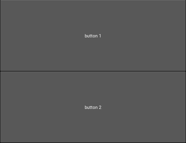
This code should give you something like the following image. You can also now click the buttons to see their colour change; this behaviour is automatic, they don’t do anything else yet.

App output showing 2 buttons

Try setting the BoxLayout orientation to 'horizontal' to see how it affects the result.

Resize the window, and note that the sizes and positions of the buttons update automatically. This happens because the BoxLayout repositions and resizes its children when its own size changes, and because it is the root widget its own size tracks that of the window. This is very important! If you replace the BoxLayout with a plain Widget (from kivy.uix.widget import Widget) this will not happen, the Buttons will both have their default position and size in the bottom left of the window. For this reason, you’ll want to use Layouts like BoxLayout all the time to automatically position things, though you can also create your own automatic bindings (see later tutorials on Kivy Properties).

With these basic ideas in hand, let’s proceed to add Widgets representing our entire calculator interface:

from kivy.app import App
from kivy.uix.button import Button
from kivy.uix.boxlayout import BoxLayout
from kivy.uix.gridlayout import GridLayout
from kivy.uix.label import Label


class YourApp(App):
    def build(self):
        root_widget = BoxLayout(orientation='vertical')

        output_label = Label(size_hint_y=1)

        button_symbols = ('1', '2', '3', '+',
                          '4', '5', '6', '-',
                          '7', '8', '9', '.',
                          '0', '*', '/', '=')

        button_grid = GridLayout(cols=4, size_hint_y=2)
        for symbol in button_symbols:
            button_grid.add_widget(Button(text=symbol))

        clear_button = Button(text='clear', size_hint_y=None,
                              height=100)

        root_widget.add_widget(output_label)
        root_widget.add_widget(button_grid)
        root_widget.add_widget(clear_button)

        return root_widget


YourApp().run()

This introduces a couple of new ideas; the GridLayout is a new layout class that arranges its child widgets in (you guessed it) a grid. We’ve set its cols` property to ``4`, which means that every 4 widgets we add it will start a new row. Since we add 16 buttons altogether, that’s 4 rows of 4.

The other new idea here is the size_hint_y setting for the output_label and button_grid. All widgets have a size_hint_x (horizontal) and size_hint_y (vertical) that you can set. They are used by Layout classes to set relative sizes; in this case, the the one with size_hint_y=2 takes up twice as much vertical space as the one with size_hint_y=1.

You can also override the size hint to set a manual width and/or height for your Widget, but you must do this explicitly, as shown here with the ‘clear’ button. By setting size_hint_y=None, we ensure that its height=100 is never overridden, this Button will have a height of 100 pixels no matter what.

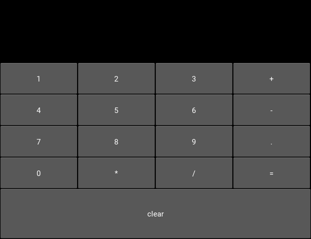
Your final code should look something like the image below. You can resize the window to see all the components move around and resize automatically, thanks to the use of Layouts for positioning.

Calculator gui image

You are strongly encouraged to experiment with modifying this code to see what happens. All the concepts used here are standard when working with Kivy widget positioning.

The calculator GUI clearly doesn’t do anything yet (although you can click on the buttons due to their default behaviour). Adding some functionality is covered in the next tutorial.

Full code

your_filename.py:

from kivy.app import App
from kivy.uix.button import Button
from kivy.uix.boxlayout import BoxLayout
from kivy.uix.gridlayout import GridLayout
from kivy.uix.label import Label


class YourApp(App):
    def build(self):
        root_widget = BoxLayout(orientation='vertical')

        output_label = Label(size_hint_y=1)

        button_symbols = ('1', '2', '3', '+',
                          '4', '5', '6', '-',
                          '7', '8', '9', '.',
                          '0', '*', '/', '=')

        button_grid = GridLayout(cols=4, size_hint_y=2)
        for symbol in button_symbols:
            button_grid.add_widget(Button(text=symbol))

        clear_button = Button(text='clear', size_hint_y=None,
                              height=100)

        root_widget.add_widget(output_label)
        root_widget.add_widget(button_grid)
        root_widget.add_widget(clear_button)

        return root_widget


YourApp().run()

Kivy tutorial 003: Building a full GUI

This is number 3 in a series of introductory Kivy tutorials.

Central themes: Adding Widgets to one another

The tutorals so far have covered the very basics of a Kivy application; getting everything running, adding a Widget (the Label), and doing some customisation.

Let’s now combine some widgets to make a larger GUI. This tutorial will solely cover joining the widgets together, not making them do anything; this is covered in later tutorials.

Note: This tutorial will construct the GUI using entirely Python code. You can always do this with Python as described here, but normally we recommend using the easier, clearer and more concise kv language to construct widget trees. This will be covered fully in later tutorials (see 007: Introducing Kivy language).

Our new task will be to build a simple calculator app; we’ll need Buttons for each of the numbers and mathematical operations, and a Label to display the result.

Let’s start with a new basic app structure:

from kivy.app import App

class YourApp(App):

    def build(self):
        return None

YourApp().run()

Right now, you can run the code but the window will be empty because we didn’t add any widgets. Let’s do that now, but we no longer want just a Label; our app will be made of multiple Widgets next to one another. For this, we use Layout classes; let’s start with the following:

from kivy.app import App
from kivy.uix.button import Button
from kivy.uix.boxlayout import BoxLayout


class YourApp(App):
    def build(self):
        layout = BoxLayout(orientation='vertical')
        b1 = Button(text='button 1')
        b2 = Button(text='button 2')

        layout.add_widget(b1)
        layout.add_widget(b2)

        return layout


YourApp().run()

We’re now instantiating three Widget classes; the BoxLayout and two Buttons. Just like with the Label, each one can be customised by passing properties. The only new one here is the orientation of the BoxLayout; passing 'vertical' means it will place its children below one another.

Note: Kivy’s design emphasises the composition of small components to achieve combined results. For instance, the Button widget is implemented as a Label with a background image and special touch-related behaviour (you can see this in the Button documentation, check the ‘Bases:’), so we can use the Label’s text property just like before. This isn’t too important right now, but knowing it can help with navigating the documentation.

After instantiating the widgets, we can add them to one another. You can almost always add any widget instance to any other in exactly this way. When you do so, the newly added widgets will appear on the screen, and you’ll be able to interact with them. The widget you add to is called the parent widget, and the added widget (in this case the Buttons) is the child widget.

This code should give you something like the following image. You can also now click the buttons to see their colour change; this behaviour is automatic, pressing them doesn’t do anything else yet.

App output showing 2 buttons

Try setting the BoxLayout orientation to 'horizontal' to see how it affects the result.

Resize the window, and note that the sizes and positions of the buttons update automatically. This happens because the BoxLayout repositions and resizes its children when its own size changes, and because it is the root widget its own size tracks that of the window. This is very important! If you replace the BoxLayout with a plain Widget (from kivy.uix.widget import Widget) this will not happen, there won’t be any code to place the Buttons so they will both have their default position and size in the bottom left of the window. For this reason, you’ll want to use Layouts like BoxLayout all the time to automatically position things, though you can also create your own automatic bindings (see later tutorials on Kivy Properties).

With these basic ideas in hand, let’s proceed to add Widgets representing our entire calculator interface:

from kivy.app import App
from kivy.uix.button import Button
from kivy.uix.boxlayout import BoxLayout
from kivy.uix.gridlayout import GridLayout
from kivy.uix.label import Label


class YourApp(App):
    def build(self):
        root_widget = BoxLayout(orientation='vertical')

        output_label = Label(size_hint_y=1)

        button_symbols = ('1', '2', '3', '+',
                          '4', '5', '6', '-',
                          '7', '8', '9', '.',
                          '0', '*', '/', '=')

        button_grid = GridLayout(cols=4, size_hint_y=2)
        for symbol in button_symbols:
            button_grid.add_widget(Button(text=symbol))

        clear_button = Button(text='clear',
                              size_hint_y=None,
                              height=100)

        root_widget.add_widget(output_label)
        root_widget.add_widget(button_grid)
        root_widget.add_widget(clear_button)

        return root_widget


YourApp().run()

This introduces a couple of new ideas; the GridLayout is a new layout class that arranges its child widgets in (you guessed it) a grid. We’ve set its cols property to 4, which means that after every 4 widgets we add it will start a new row. Since we add 16 buttons altogether, that’s 4 rows of 4. Try adding an extra button or two to understand exactly how it’s working.

The other new idea here is the size_hint_y setting for the output_label and button_grid. All widgets have a size_hint_x (horizontal) and size_hint_y (vertical) that you can set. They are used by Layout classes to set relative sizes; in this case, the the one with size_hint_y=2 takes up twice as much vertical space as the one with size_hint_y=1.

You can also override the size hint to set a manual width and/or height for your Widget, but you must do this explicitly, as shown here with the ‘clear’ button. By setting size_hint_y=None, we ensure that its height=100 is never overridden, this Button will have a height of 100 pixels no matter what.

Your final code should look something like the image below. You can resize the window to see all the components move around and resize automatically, thanks to the use of Layouts for positioning.

Calculator gui image

You are strongly encouraged to experiment with modifying this code to see what happens. All the concepts used here are standard when working with Kivy widget positioning.

The calculator GUI clearly doesn’t do anything yet (although you can click on the buttons due to their default behaviour). Adding some functionality is covered in the next tutorial.

Next tutorial: Making the GUI do stuff, binding to events

Full code

your_filename.py:

from kivy.app import App
from kivy.uix.button import Button
from kivy.uix.boxlayout import BoxLayout
from kivy.uix.gridlayout import GridLayout
from kivy.uix.label import Label


class YourApp(App):
    def build(self):
        root_widget = BoxLayout(orientation='vertical')

        output_label = Label(size_hint_y=1)

        button_symbols = ('1', '2', '3', '+',
                          '4', '5', '6', '-',
                          '7', '8', '9', '.',
                          '0', '*', '/', '=')

        button_grid = GridLayout(cols=4, size_hint_y=2)
        for symbol in button_symbols:
            button_grid.add_widget(Button(text=symbol))

        clear_button = Button(text='clear', size_hint_y=None,
                              height=100)

        root_widget.add_widget(output_label)
        root_widget.add_widget(button_grid)
        root_widget.add_widget(clear_button)

        return root_widget


YourApp().run()

Kivy tutorial 002: Improving appearance, customising widgets using Kivy Properties

Central themes: Modifying Widget appearance, Kivy properties

It’s great to say Hello World, but it looks pretty boring, and you’d expect that you’d be able to customise the appearance of text. Fortunately, you’d be right…so let’s do it.

We’ll continue modifying the code from last time, which was:

from kivy.app import App
from kivy.uix.label import Label

class YourApp(App):
    def build(self):
    root_widget = Label(text='Hello world!')
    return root_widget

YourApp().run()

The basic way to modify things in Kivy is to change Kivy properties of the widgets. As far as we’re concerned right now, we can set these by passing arguments at instantiation, or by treating them as attributes of the class. For instance, we could also have set the text as follows:

root_widget = Label()
root_widget.text = 'Hello world!'

Let’s set ourselves three goals:

  • Make the text larger
  • Italicise the text
  • Colour "Hello" and "world!" differently

To customise the Label appearance, we must check the documentation to find an appropriate Kivy property. For the text size, check the Label doc and find the font_size listing. It looks something like the following:

Font size doc from Kivy website

Following the documentation, this lets us set the font size in pixels, and it defaults to '15sp'. This is a special Kivy syntax, the sp units automatically scale the font size according to the DPI of the display and the user’s font size setting (on some platforms); on desktop on a non-hidpi display, it is just 15 pixels. For now let’s just set a simple pixel number:

root_widget = Label(
    text='Hello world!',
    font_size=100)

You can run the code now to see the result.

To make the text italic, the procedure is the same. Check the Label doc and find the italic property entry. you’ll see that this is a BooleanProperty that defaults to False; just set it to True to enable the underline:

root_widget = Label(
    text='Hello world!',
    font_size=100,
    italic=True)

Finally, we want to colour Hello and world! differently. Things are a little different here as we can’t use a single property setting to modify the whole string, since the two words should be treated differently.

Instead we enable the markup property:

root_widget = Label(
    text='Hello world!',
    font_size=100,
    underline=True,
    markup=True)

You can now use Kivy’s markup syntax to modify the text within the Label. Try the following:

root_widget = Label(
    font_size=100,
    italic=True,
    markup=True)
root_widget.text = '[color=#ff0000]Hello[/color] [color=#00ff00]world![/color]'

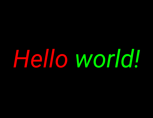
Now run the application again, python your_filename.py. The result should now look something like the following image.

Output for example app.

Note

This is just a basic introduction to customising Kivy widgets, you can use similar methods to accomplish many different changes in many different scenarios. Kivy properties also have other important functionality, covered later in these tutorials.

Full code

The full code for this exercise was:

from kivy.app import App
from kivy.uix.label import Label

class YourApp(App):

    def build(self):
        root_widget = Label(
            font_size=100,
            italic=True,
            markup=True)
        root_widget.text = '[color=#ff0000]Hello[/color] [color=#00ff00]world![/color]'
        return root_widget

YourApp().run()

Kivy tutorial 002: Improving appearance, customising widgets using Kivy Properties

This is number 2 in a series of introductory Kivy tutorials.

Central themes: Modifying Widget appearance, Kivy properties

It’s great to say Hello World, but it looks pretty boring, and you’d expect that you’d be able to customise the appearance of text. Fortunately, you’d be right…so let’s do it.

We’ll continue modifying the code from last time, which was:

from kivy.app import App
from kivy.uix.label import Label

class YourApp(App):
    def build(self):
      root_widget = Label(text='Hello world!')
      return root_widget

YourApp().run()

The basic way to modify things in Kivy is to change Kivy properties of the widgets. As far as we’re concerned right now, we can set these by passing arguments at instantiation, or by treating them as attributes of the class. For instance, we could also have set the text as follows:

root_widget = Label()
root_widget.text = 'Hello world!'

Let’s set ourselves three goals:

  • Make the text larger
  • Italicise the text
  • Colour “Hello” and “world!” differently

To customise the Label appearance, we must check the documentation to find an appropriate Kivy property. For the text size, check the Label doc and find the font_size listing. It looks something like the following:

Font size doc from Kivy website

Following the documentation, this lets us set the font size in pixels, and it defaults to '15sp'. This is a special Kivy syntax, the sp units automatically scale the font size according to the DPI of the display and the user’s font size setting (on some platforms); on desktop on a non-hidpi display, it is just 15 pixels. For now let’s just set a simple pixel number:

root_widget = Label(
    text='Hello world!',
    font_size=100)

You can run the code now to see the result.

To make the text italic, the procedure is the same. Check the Label doc and find the italic property entry. you’ll see that this is a BooleanProperty that defaults to False; just set it to True to enable the underline:

root_widget = Label(
    text='Hello world!',
    font_size=100,
    italic=True)

Finally, we want to colour Hello and world! differently. Things are a little different here as we can’t use a single property setting to modify the whole string, since the two words should be treated differently.

Instead we enable the markup property:

root_widget = Label(
    text='Hello world!',
    font_size=100,
    underline=True,
    markup=True)

You can now use Kivy’s markup syntax to modify the text within the Label. Try the following:

root_widget = Label(
    font_size=100,
    italic=True,
    markup=True)
root_widget.text = '[color=#ff0000]Hello[/color] [color=#00ff00]world![/color]'

Now run the application again, python your_filename.py. The result should now look something like the following image.

Output for example app.

Note: This is just a basic introduction to customising Kivy widgets, you can use similar methods to manipulate different widgets in a huge range of different ways. Kivy properties also have other important functionality, covered later in these tutorials.

Next tutorial: Building a full GUI

Full code

The full code for this exercise was:

from kivy.app import App
from kivy.uix.label import Label

class YourApp(App):

    def build(self):
        root_widget = Label(
            font_size=100,
            italic=True,
            markup=True)
        root_widget.text = '[color=#ff0000]Hello[/color] [color=#00ff00]world![/color]'
        return root_widget

YourApp().run()