This is number 3 in a series of introductory Kivy tutorials.
Central themes: Adding Widgets to one another
The tutorals so far have covered the very basics of a Kivy application; getting everything running, adding a Widget (the Label), and doing some customisation.
Let’s now combine some widgets to make a larger GUI. This tutorial will solely cover joining the widgets together, not making them do anything; this is covered in later tutorials.
Note: This tutorial will construct the GUI using entirely Python code. You can always do this with Python as described here, but normally we recommend using the easier, clearer and more concise kv language to construct widget trees. This will be covered fully in later tutorials (see 007: Introducing Kivy language).
Our new task will be to build a simple calculator app; we’ll need Buttons for each of the numbers and mathematical operations, and a Label to display the result.
Let’s start with a new basic app structure:
from kivy.app import App

class YourApp(App):

    def build(self):
        return None

YourApp().run()
Right now, you can run the code but the window will be empty because we didn’t add any widgets. Let’s do that now, but we no longer want just a Label; our app will be made of multiple Widgets next to one another. For this, we use Layout classes; let’s start with the following:
from kivy.app import App
from kivy.uix.button import Button
from kivy.uix.boxlayout import BoxLayout


class YourApp(App):
    def build(self):
        layout = BoxLayout(orientation='vertical')
        b1 = Button(text='button 1')
        b2 = Button(text='button 2')

        layout.add_widget(b1)
        layout.add_widget(b2)

        return layout


YourApp().run()
We’re now instantiating three Widget classes; the BoxLayout and two Buttons. Just like with the Label, each one can be customised by passing properties. The only new one here is the orientation of the BoxLayout; passing 'vertical' means it will place its children below one another.
Note: Kivy’s design emphasises the composition of small components to achieve combined results. For instance, the Button widget is implemented as a Label with a background image and special touch-related behaviour (you can see this in the Button documentation, check the ‘Bases:’), so we can use the Label’s text property just like before. This isn’t too important right now, but knowing it can help with navigating the documentation.
After instantiating the widgets, we can add them to one another. You can almost always add any widget instance to any other in exactly this way. When you do so, the newly added widgets will appear on the screen, and you’ll be able to interact with them. The widget you add to is called the parent widget, and the added widget (in this case the Buttons) is the child widget.
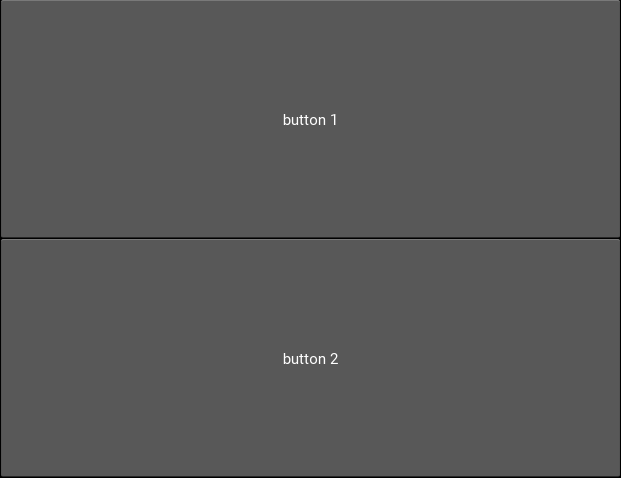
This code should give you something like the following image. You can also now click the buttons to see their colour change; this behaviour is automatic, pressing them doesn’t do anything else yet.
Try setting the BoxLayout orientation to 'horizontal' to see how it affects the result.
Resize the window, and note that the sizes and positions of the buttons update automatically. This happens because the BoxLayout repositions and resizes its children when its own size changes, and because it is the root widget its own size tracks that of the window. This is very important! If you replace the BoxLayout with a plain Widget (from kivy.uix.widget import Widget) this will not happen, there won’t be any code to place the Buttons so they will both have their default position and size in the bottom left of the window. For this reason, you’ll want to use Layouts like BoxLayout all the time to automatically position things, though you can also create your own automatic bindings (see later tutorials on Kivy Properties).
With these basic ideas in hand, let’s proceed to add Widgets representing our entire calculator interface:
from kivy.app import App
from kivy.uix.button import Button
from kivy.uix.boxlayout import BoxLayout
from kivy.uix.gridlayout import GridLayout
from kivy.uix.label import Label


class YourApp(App):
    def build(self):
        root_widget = BoxLayout(orientation='vertical')

        output_label = Label(size_hint_y=1)

        button_symbols = ('1', '2', '3', '+',
                          '4', '5', '6', '-',
                          '7', '8', '9', '.',
                          '0', '*', '/', '=')

        button_grid = GridLayout(cols=4, size_hint_y=2)
        for symbol in button_symbols:
            button_grid.add_widget(Button(text=symbol))

        clear_button = Button(text='clear',
                              size_hint_y=None,
                              height=100)

        root_widget.add_widget(output_label)
        root_widget.add_widget(button_grid)
        root_widget.add_widget(clear_button)

        return root_widget


YourApp().run()
This introduces a couple of new ideas; the GridLayout is a new layout class that arranges its child widgets in (you guessed it) a grid. We’ve set its cols property to 4, which means that after every 4 widgets we add it will start a new row. Since we add 16 buttons altogether, that’s 4 rows of 4. Try adding an extra button or two to understand exactly how it’s working.
The other new idea here is the size_hint_y setting for the output_label and button_grid. All widgets have a size_hint_x (horizontal) and size_hint_y (vertical) that you can set. They are used by Layout classes to set relative sizes; in this case, the the one with size_hint_y=2 takes up twice as much vertical space as the one with size_hint_y=1.
You can also override the size hint to set a manual width and/or height for your Widget, but you must do this explicitly, as shown here with the ‘clear’ button. By setting size_hint_y=None, we ensure that its height=100 is never overridden, this Button will have a height of 100 pixels no matter what.
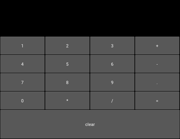
Your final code should look something like the image below. You can resize the window to see all the components move around and resize automatically, thanks to the use of Layouts for positioning.
You are strongly encouraged to experiment with modifying this code to see what happens. All the concepts used here are standard when working with Kivy widget positioning.
The calculator GUI clearly doesn’t do anything yet (although you can click on the buttons due to their default behaviour). Adding some functionality is covered in the next tutorial.
Next tutorial: Making the GUI do stuff, binding to events
Full code
your_filename.py:
from kivy.app import App
from kivy.uix.button import Button
from kivy.uix.boxlayout import BoxLayout
from kivy.uix.gridlayout import GridLayout
from kivy.uix.label import Label


class YourApp(App):
    def build(self):
        root_widget = BoxLayout(orientation='vertical')

        output_label = Label(size_hint_y=1)

        button_symbols = ('1', '2', '3', '+',
                          '4', '5', '6', '-',
                          '7', '8', '9', '.',
                          '0', '*', '/', '=')

        button_grid = GridLayout(cols=4, size_hint_y=2)
        for symbol in button_symbols:
            button_grid.add_widget(Button(text=symbol))

        clear_button = Button(text='clear', size_hint_y=None,
                              height=100)

        root_widget.add_widget(output_label)
        root_widget.add_widget(button_grid)
        root_widget.add_widget(clear_button)

        return root_widget


YourApp().run()